
Since our launch we have been trying several things to grow awareness around Widgetkraft. Meetings, outreach, design iterations. Things were moving, but slowly. Then one small observation changed everything.
1.Things Were Okay But Not Great
Since our launch we have been trying several things to grow awareness around Widgetkraft.
- Spoke with founders
- Had conversations with agency owners
- Did small meetups both virtual and offline
Things were going okay, but not great. Yes, we had around 30 signups. But most of those came from people who were already on our waitlist.
New users were not converting the way we expected.
So we started doing what most founders do. We thought maybe the landing page needs better design. Maybe the messaging needs improvement. Maybe the visuals need more polish.
2.The Moment We Noticed Something Odd
During one casual discussion, my co founder pointed out something interesting.
People were landing on the website, reaching the sign in or sign up page, and then leaving.
- No account created
- No interaction
- Just drop off
At first it sounded strange. If someone has already reached the signup page, they are probably interested. So why leave at the last step?
That is when we decided to open the live production pages and actually look at them carefully.
3.The Problem Was Hiding in Plain Sight
When I opened the signup page I was honestly surprised.
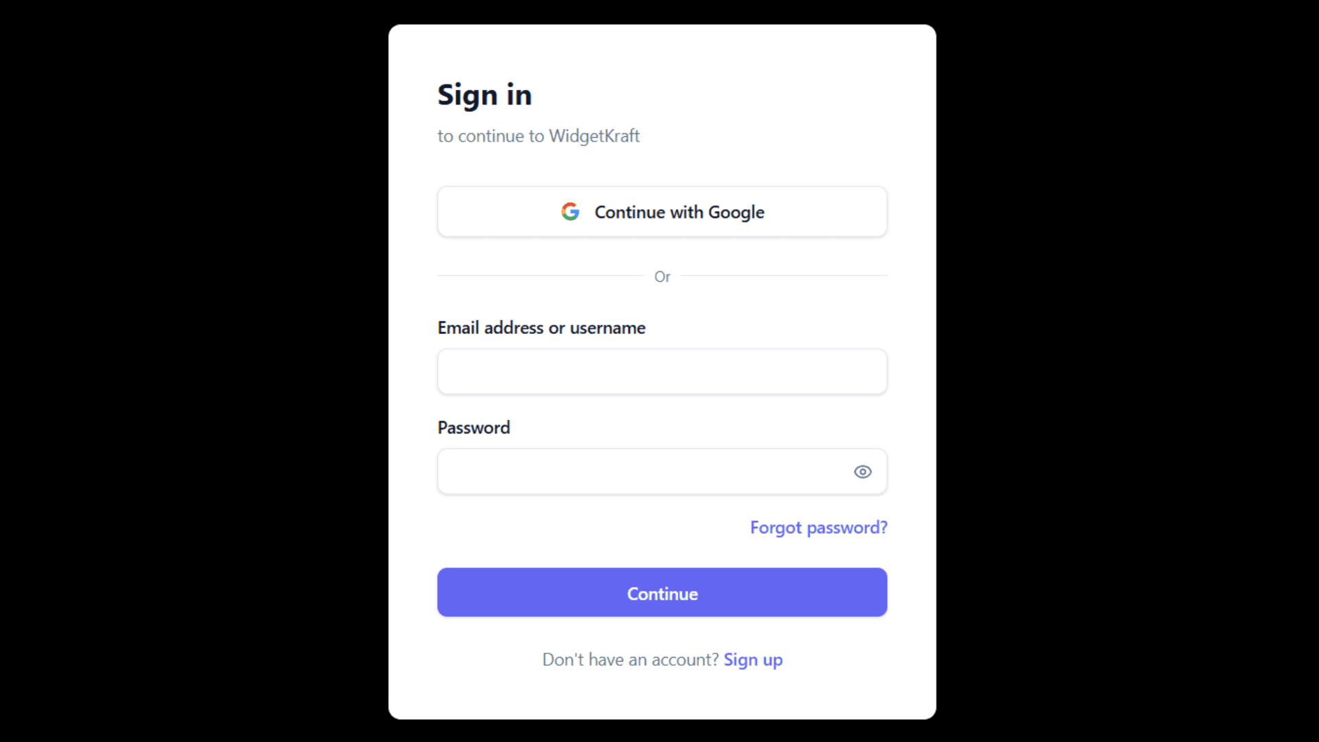
It was extremely generic.
Just a basic form sitting there with almost no context. From our perspective it felt normal because we had seen it many times while building the product.
But from a new visitor's perspective it probably raised more questions than answers.
- What exactly does this product do?
- What happens after I sign up?
- Why should I create an account right now?
4.So We Decided to Fix the Smallest Thing
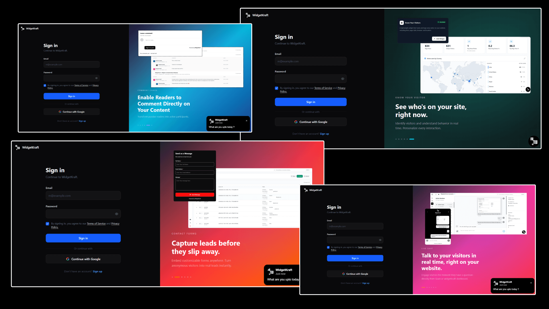
Instead of redesigning the whole product or changing our growth strategy, we focused on improving the signup and signin pages.
- Added clearer messaging about our main USP
- Included interactive UI previews showing what is possible with Widgetkraft
- Simplified the wording so anyone landing there could quickly understand what they are signing up for
The goal was simple.
Reduce even the smallest doubt someone might have before creating an account.
5.The Results Came Faster Than Expected
What surprised us was how quickly things started improving.
Within about 15 days after the redesign, we began seeing better signup rates.
- More visitors who reached the signup page were actually creating accounts
- People started talking to us through the live chat widget on the page
- Some visitors mentioned the new page looked cleaner and helped them understand the product better
6.The Small Lesson We Learned
As founders we often look for big changes.
- New marketing channels
- New growth tactics
- Big redesigns
But sometimes the biggest improvement comes from fixing something very small that sits right in front of us. In our case it was just the signup page. A tiny part of the product that we had ignored for a while.
Enhancing that one piece changed how people moved from curiosity to actually signing up.
Sometimes growth is not about doing more. Sometimes it is about improving the smallest step in your user journey.
Sometimes the smallest fix has the biggest impact.
Widgetkraft helps you understand where visitors drop off, what they are confused about, and how to make every step of their journey clearer, from landing to signup.
If you are not sure where your funnel is leaking, start by actually looking at each page the way a new visitor would.